A guide on photography in Forza Motorsport 4 (and beyond)
+2
SnippetyOggy86
Othelion
6 posters
:: The Paddock :: Forza Discussion
Page 1 of 2
Page 1 of 2 • 1, 2 
 A guide on photography in Forza Motorsport 4 (and beyond)
Whether it is to show a livery you made to the world, to reflect some moments of a race you were in, to try to frame that car you love, or simply to enjoy yourself exploring this part of Forza: we all tried our hands on the photomode at some point. While some may have booked great results, I’m pretty sure most of us weren’t overwhelmed when they saw their pictures on the pc. I had that at first too, and almost gave up on the photomode, until I saw what some people managed to achieve with it. Since there is a proper lack of guides on the photomode, it can be quite overwhelming to get in to for those less familiar with photography. With this guide I hope to get you guys started too, so that the beautiful paint you enter in the paint competition for instance will be done justice with its pictures.
There are 2 big sides of making a photo: a creative component and a technical one. Indeed, and this is very important, taking photos is far more than adjusting those sliders when pressing Y. When we are unhappy with our pictures, most will probably be blaming their lack of knowledge of good slider settings, while it already has gone wrong somewhere else. Good photos start with a good composition, and that is where I will start the guide.
Composition
With composition we mean the placement of the subject(s) and all surroundings in the frame. Ask yourself: what do I want to show in this picture? Letting the viewer see what you want him to see is probably the biggest challenge in photography, more so than having a technically correct picture.
1. It all starts with the moment the photo is taken. Luckily, we can precisely choose this moment with the rewind and forward buttons. Beware of the tire marks, smoke and dust that don’t rewind as you’d expect it to (to solve: rewind a bit further and then forward again to where you want). Look for the perfect moment as the car hits the apex, 2 cars hit eachother, cars are overtaking, passing a good looking landmark,…
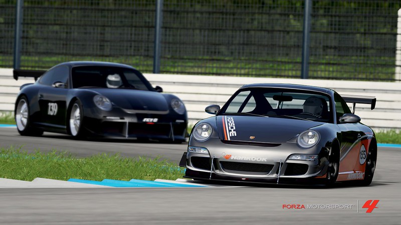
2. Rule of thirds: the most basic guideline in photography. Think of dividing your frame in 3 equal horizontal and vertical parts. The human mind finds photographs more esthetic when subjects are placed on one of these intersecting lines. In other words, placing your subjects out of the centre of the image can make it look better (and usually does). Just don’t follow this too strictly, or you’ll miss some great shots.
3. Direct your viewer through the image. With moving subjects, which cars usually are, we normally want to show where it is going to. The way the human mind works, when we look at a photo we like to be able to imagine what’s happening next. A car moving from left to right, placed on the left side of the image, will show part of the road ahead. Placed on the right, the car will appear to be driving out of the frame, leaving a part of the photo on the left where no one will look at. There are exceptions again like kicked up dust from leaving the track, tire smoke from drifting, other cars in your wake,…
4. Fill your frame. Show what you want to show and leave out everything else. This will grab the attention of the viewer to what really matters. The more your subject fills the frame, the more details will appear that make it really interesting. It will also remove distractions from your subject. This doesn’t mean that you have to zoom in every time until there is only a car in the image. Grab what you want from your surroundings, but avoid the excess parts.

5. Use the zoom (and walk around). We have the luxury of a surreal zoom lens that goes from very wide angle to super telephoto reach. Standing close and using the wide angle part of the lens (zoomed out), will let you show a lot of the surroundings while still showing a lot of car. It makes it also easier to show a sense of speed. The major disadvantage is that it has the highest distortion levels: all proportions are incorrect. When standing further away, and zooming in, your view gets narrower. The car will get isolated from its surroundings, which can be good or bad (you need to find the right combination of car and environment for the picture you want). A big plus is that the car’s proportions become normal again, which is especially important if we want to showcase the car. Think of portrait photographers standing a few meters away from their models in order to avoid these distortions like a big nose. A last point to note with this is that the viewer will always place himself on the point where the photo is taken from. When doing race reports, it feels more natural to have pictures taken from where the tv cameras and press would be than from whacky angles.
6. Using angles can make your photos more dynamic. Motorsport is intense, fast, exciting. To capture some of these emotions, tilting your camera slightly can do wonders. As always, too much is too much, so don't overdo it. It really depends on the picture. Single car action shots can usually cope with more angle than group shots. If you find yourself turning your head when looking at the picture, you know it's too much. You don't have to do this on every single shot either, or it will quickly become boring.
The sliders
While there are a lot of sliders, I divide them in groups, each with their type of effect, which makes them easier to understand. There are the creative sliders (shutter speed, aperture, focus and vignetting), coloring (color, sepia) and lighting (exposure, contrast, brightness).
Shutter speed: this determines the time interval over which the photo is taken. The higher the number, the slower the shutter speed and thus more time that is captured in one photo. It allows to capture motion in the pictures. The object focused on will be followed by the camera while taking the picture, making it sharp. Everything moving at a different speed will be blurred. With the shutter speed slider, you determine the amount of blur. For a moving car, it is usually interesting to get at least some blur in the wheels to imply movement. When you want 2 or more cars to be sharp you have to be really careful with this slider as it quickly will blur one of the cars as well. Too much will also show itself in busy, distracting blurs, while we usually want them smooth to not draw much attention.
Aperture: the amount the iris of the lens opens. This determines the depth of field, or how much of the area in front and behind your focus point is sharp. The higher the setting, the shallower depth of field becomes, isolating the subject from its surroundings. While this also blurs, it is a different kind of blur than that from the shutter speed. This one doesn’t look at speed, but at distance. It is especially useful in Forza, to blur a lot of the low texture surroundings. Set it high enough so that you only have sharpness where you want it (mostly the cars). Too high will result in an unrealistic blur, so beware of that. The closer you stand to your focus point, the stronger the aperture effect will be, so you’ll need lower settings when you stand close to the cars.
Focus: 9/10 times we focus using X, but in some cases adjusting focus this way helps with getting the sharpness exactly where you want it to. This slider will move the focus point closer or further, focus point being the distance that is displayed the sharpest. To clearly see where you are moving the focus point, use aperture 100 while moving it. But as said, you can usually skip this slider.
Vignetting: this is an effect to recreate a certain lens fault (dark edges). You can choose between 3 types of vignette by pressing the shoulder buttons. While it can be refreshing at times, a lot of photographers overuse it. If you decide to use it, be careful with the intensity, but normally this is a slider better left at 0.
Coloring: color determines the saturation level of the colors. 0 is black and white, while 100 makes the colors jump out to you. Sepia is the white balancing tool in Forza. At 100, it gives the actual sepia look, but at lower levels of intensity it helps making your colors look warmer or cooler. Setting these depends on the light. Sunlight is warm light, and photographing the sunlit sides of a car doesn’t require much sepia to be get correct colors. Shadows are much cooler, so they require extra sepia to get those colors correct.
Lighting: exposure is the main slider in this group. It determines the amount of light captured by the camera. Something is underexposed when the image is too dark, and loses details in this darkness. Overexposed is when there are pure whites in the image, losing details there. These can be easily seen when you slide the exposure slider up. It starts with small white dots and in the end almost all detail is lost in the white. Darker areas, like shadows and tunnels, require more exposure than bright sunlight.
Contrast is the amount of difference there is between the dark and light areas. A lower setting makes shadows look more equally lighted than bright areas, and too little will make the picture look dull. Higher settings will liven up the image, creating harder shadows and brighter highlights, but too much will make it look unrealistic. I find that when photographing shadow sides, a lower contrast setting helps to keep the detail visible everywhere.
Brightness is the big compensation button for the previous settings I feel. It will make everything lighter or darker in an equal way, so slide this as last to get the total amount of light in the picture where you want it.
A starting point
I never save over these settings, which I feel are a good starting point for every picture. Note that they are just that, a starting point that delivers good quality images in direct sunlight on most tracks.
Shutter speed: 10
Aperture: 72
These 2 need to be changed always!
Color: 80
Sepia: 25
For shadows I usually go to sepia 40 and then fine adjust.
Exposure: 50
Contrast: 60
Brightness: 42
For shadows: more exposure, less contrast, less brightness usually.
Focus: whatever
Vignetting: 0
As a last tip, when taking photos and adjusting the settings, be aware that your computer and tv screens will be calibrated differently, unless you’re one of the few who used calibration equipment. What this means is, that the pictures you take in game look different when viewed on your computer. I suspect part of that difference is also due to the way Forza uploads the images and creates the jpegs on fm.net, so even calibrating won’t solve it all. The only way to make sure your new settings look great, is by inspecting them directly after uploading. If you keep your camera where it is while inspecting, you can make small corrections to the settings and take a second shot. This will prevent some disappointment.
Some examples
In order to further clarify some of my points, I will show you a few pictures in which you can see a few things wrong, and how to improve on them. All pictures are taken by myself, but feature 2 lovely car designs from Afroduck and Clark.

In this picture, we can see the car placed following the rule of thirds, and the view of the corners is ok. The timing of the shot is pretty bad though, as the car is in between both apexes. The car is pretty small as well, and we can't see much details of it. We would get a better shot if we waited a bit more for the car to get closer to the apex of the second corner.

This photo is taken at exactly the same moment as the previous one. As you can see I've chosen to fill the screen and isolate the car from the environment. We're at about the same distance from the car as in the previous shot, only more to the right of course, and with a high zoom factor. The shutter speed is fairly high, as you can see from the wheels and the stripes in the track, which shows this car is moving fast. There's no telling the car is cornering anymore, due to the high zoom we have a narrow view and the car is too far from the apexes to show those.
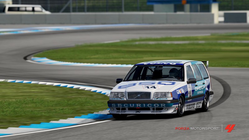
Back to the point of view from the first picture, but we stopped the replay when the car clipped the apex. You can see rule of thirds in car placement. We can see the whole corner again, but this time the car is much bigger and shows more details. As the car hits the apex, it also shows better that the car is racing. We can see where the car is going to, the car is going from right to left and is placed on the right side, leaving a lot of picture on the left still to be driven on.

The car has left the apex, and the corner is behind us. The car is placed according to rule of thirds, but is driving out of the photo. It isn't too dramatic as there is still a bit of track left of the car. The closer the car is to the edge, the worse it becomes. Now we still have a somewhat interesting chicane behind us, but if this were a straight line it would've been really bad.

This series of images is more about angles. Here we have the camera very close to the car, zoomed out a lot. As you can see this camera placement distorts all lines a lot, screwing up all proportions. We're left with a weird looking car, and don't do any justice to the paint job. On the plus side, we can see at the bottom the speed stripes in the asphalt. A close camera can be used to make some dramatic action shots. We also have a wide look at our environment, which isn't too spectacular in this case.

At the same time as the previous shot, but with the camera much further from the car and zoomed in a lot. We can see the proportions of the car are normal again. The paint job already looks much better here. With shutter speed 0 and aperture 0, the car seems to be stopped, and there is no depth of field. In this case, the lower texture background still looks ok but most of the times it's much worse. Still, we can do better.

Same shot as the previous one, but with blurred background, wheels in motion and speed stripes. We can be happy with this shot.

Another example of what a close to the car wide angle shot does.

And this is what the car really looks like.
I hope you enjoyed reading this and that it helped improving your photography. I encourage everyone to post your photos when you make one you love. And also photo settings, when you find great ones. We can all learn from each other. Any questions will be happily answered, alas I'm no photo guru either so there is only so much I do know.
There are 2 big sides of making a photo: a creative component and a technical one. Indeed, and this is very important, taking photos is far more than adjusting those sliders when pressing Y. When we are unhappy with our pictures, most will probably be blaming their lack of knowledge of good slider settings, while it already has gone wrong somewhere else. Good photos start with a good composition, and that is where I will start the guide.
Composition
With composition we mean the placement of the subject(s) and all surroundings in the frame. Ask yourself: what do I want to show in this picture? Letting the viewer see what you want him to see is probably the biggest challenge in photography, more so than having a technically correct picture.
1. It all starts with the moment the photo is taken. Luckily, we can precisely choose this moment with the rewind and forward buttons. Beware of the tire marks, smoke and dust that don’t rewind as you’d expect it to (to solve: rewind a bit further and then forward again to where you want). Look for the perfect moment as the car hits the apex, 2 cars hit eachother, cars are overtaking, passing a good looking landmark,…

2. Rule of thirds: the most basic guideline in photography. Think of dividing your frame in 3 equal horizontal and vertical parts. The human mind finds photographs more esthetic when subjects are placed on one of these intersecting lines. In other words, placing your subjects out of the centre of the image can make it look better (and usually does). Just don’t follow this too strictly, or you’ll miss some great shots.
3. Direct your viewer through the image. With moving subjects, which cars usually are, we normally want to show where it is going to. The way the human mind works, when we look at a photo we like to be able to imagine what’s happening next. A car moving from left to right, placed on the left side of the image, will show part of the road ahead. Placed on the right, the car will appear to be driving out of the frame, leaving a part of the photo on the left where no one will look at. There are exceptions again like kicked up dust from leaving the track, tire smoke from drifting, other cars in your wake,…
4. Fill your frame. Show what you want to show and leave out everything else. This will grab the attention of the viewer to what really matters. The more your subject fills the frame, the more details will appear that make it really interesting. It will also remove distractions from your subject. This doesn’t mean that you have to zoom in every time until there is only a car in the image. Grab what you want from your surroundings, but avoid the excess parts.

5. Use the zoom (and walk around). We have the luxury of a surreal zoom lens that goes from very wide angle to super telephoto reach. Standing close and using the wide angle part of the lens (zoomed out), will let you show a lot of the surroundings while still showing a lot of car. It makes it also easier to show a sense of speed. The major disadvantage is that it has the highest distortion levels: all proportions are incorrect. When standing further away, and zooming in, your view gets narrower. The car will get isolated from its surroundings, which can be good or bad (you need to find the right combination of car and environment for the picture you want). A big plus is that the car’s proportions become normal again, which is especially important if we want to showcase the car. Think of portrait photographers standing a few meters away from their models in order to avoid these distortions like a big nose. A last point to note with this is that the viewer will always place himself on the point where the photo is taken from. When doing race reports, it feels more natural to have pictures taken from where the tv cameras and press would be than from whacky angles.
6. Using angles can make your photos more dynamic. Motorsport is intense, fast, exciting. To capture some of these emotions, tilting your camera slightly can do wonders. As always, too much is too much, so don't overdo it. It really depends on the picture. Single car action shots can usually cope with more angle than group shots. If you find yourself turning your head when looking at the picture, you know it's too much. You don't have to do this on every single shot either, or it will quickly become boring.

The sliders
While there are a lot of sliders, I divide them in groups, each with their type of effect, which makes them easier to understand. There are the creative sliders (shutter speed, aperture, focus and vignetting), coloring (color, sepia) and lighting (exposure, contrast, brightness).
Shutter speed: this determines the time interval over which the photo is taken. The higher the number, the slower the shutter speed and thus more time that is captured in one photo. It allows to capture motion in the pictures. The object focused on will be followed by the camera while taking the picture, making it sharp. Everything moving at a different speed will be blurred. With the shutter speed slider, you determine the amount of blur. For a moving car, it is usually interesting to get at least some blur in the wheels to imply movement. When you want 2 or more cars to be sharp you have to be really careful with this slider as it quickly will blur one of the cars as well. Too much will also show itself in busy, distracting blurs, while we usually want them smooth to not draw much attention.
Aperture: the amount the iris of the lens opens. This determines the depth of field, or how much of the area in front and behind your focus point is sharp. The higher the setting, the shallower depth of field becomes, isolating the subject from its surroundings. While this also blurs, it is a different kind of blur than that from the shutter speed. This one doesn’t look at speed, but at distance. It is especially useful in Forza, to blur a lot of the low texture surroundings. Set it high enough so that you only have sharpness where you want it (mostly the cars). Too high will result in an unrealistic blur, so beware of that. The closer you stand to your focus point, the stronger the aperture effect will be, so you’ll need lower settings when you stand close to the cars.
Focus: 9/10 times we focus using X, but in some cases adjusting focus this way helps with getting the sharpness exactly where you want it to. This slider will move the focus point closer or further, focus point being the distance that is displayed the sharpest. To clearly see where you are moving the focus point, use aperture 100 while moving it. But as said, you can usually skip this slider.
Vignetting: this is an effect to recreate a certain lens fault (dark edges). You can choose between 3 types of vignette by pressing the shoulder buttons. While it can be refreshing at times, a lot of photographers overuse it. If you decide to use it, be careful with the intensity, but normally this is a slider better left at 0.
Coloring: color determines the saturation level of the colors. 0 is black and white, while 100 makes the colors jump out to you. Sepia is the white balancing tool in Forza. At 100, it gives the actual sepia look, but at lower levels of intensity it helps making your colors look warmer or cooler. Setting these depends on the light. Sunlight is warm light, and photographing the sunlit sides of a car doesn’t require much sepia to be get correct colors. Shadows are much cooler, so they require extra sepia to get those colors correct.
Lighting: exposure is the main slider in this group. It determines the amount of light captured by the camera. Something is underexposed when the image is too dark, and loses details in this darkness. Overexposed is when there are pure whites in the image, losing details there. These can be easily seen when you slide the exposure slider up. It starts with small white dots and in the end almost all detail is lost in the white. Darker areas, like shadows and tunnels, require more exposure than bright sunlight.
Contrast is the amount of difference there is between the dark and light areas. A lower setting makes shadows look more equally lighted than bright areas, and too little will make the picture look dull. Higher settings will liven up the image, creating harder shadows and brighter highlights, but too much will make it look unrealistic. I find that when photographing shadow sides, a lower contrast setting helps to keep the detail visible everywhere.
Brightness is the big compensation button for the previous settings I feel. It will make everything lighter or darker in an equal way, so slide this as last to get the total amount of light in the picture where you want it.
A starting point
I never save over these settings, which I feel are a good starting point for every picture. Note that they are just that, a starting point that delivers good quality images in direct sunlight on most tracks.
Shutter speed: 10
Aperture: 72
These 2 need to be changed always!
Color: 80
Sepia: 25
For shadows I usually go to sepia 40 and then fine adjust.
Exposure: 50
Contrast: 60
Brightness: 42
For shadows: more exposure, less contrast, less brightness usually.
Focus: whatever
Vignetting: 0
As a last tip, when taking photos and adjusting the settings, be aware that your computer and tv screens will be calibrated differently, unless you’re one of the few who used calibration equipment. What this means is, that the pictures you take in game look different when viewed on your computer. I suspect part of that difference is also due to the way Forza uploads the images and creates the jpegs on fm.net, so even calibrating won’t solve it all. The only way to make sure your new settings look great, is by inspecting them directly after uploading. If you keep your camera where it is while inspecting, you can make small corrections to the settings and take a second shot. This will prevent some disappointment.
Some examples
In order to further clarify some of my points, I will show you a few pictures in which you can see a few things wrong, and how to improve on them. All pictures are taken by myself, but feature 2 lovely car designs from Afroduck and Clark.

In this picture, we can see the car placed following the rule of thirds, and the view of the corners is ok. The timing of the shot is pretty bad though, as the car is in between both apexes. The car is pretty small as well, and we can't see much details of it. We would get a better shot if we waited a bit more for the car to get closer to the apex of the second corner.

This photo is taken at exactly the same moment as the previous one. As you can see I've chosen to fill the screen and isolate the car from the environment. We're at about the same distance from the car as in the previous shot, only more to the right of course, and with a high zoom factor. The shutter speed is fairly high, as you can see from the wheels and the stripes in the track, which shows this car is moving fast. There's no telling the car is cornering anymore, due to the high zoom we have a narrow view and the car is too far from the apexes to show those.

Back to the point of view from the first picture, but we stopped the replay when the car clipped the apex. You can see rule of thirds in car placement. We can see the whole corner again, but this time the car is much bigger and shows more details. As the car hits the apex, it also shows better that the car is racing. We can see where the car is going to, the car is going from right to left and is placed on the right side, leaving a lot of picture on the left still to be driven on.

The car has left the apex, and the corner is behind us. The car is placed according to rule of thirds, but is driving out of the photo. It isn't too dramatic as there is still a bit of track left of the car. The closer the car is to the edge, the worse it becomes. Now we still have a somewhat interesting chicane behind us, but if this were a straight line it would've been really bad.

This series of images is more about angles. Here we have the camera very close to the car, zoomed out a lot. As you can see this camera placement distorts all lines a lot, screwing up all proportions. We're left with a weird looking car, and don't do any justice to the paint job. On the plus side, we can see at the bottom the speed stripes in the asphalt. A close camera can be used to make some dramatic action shots. We also have a wide look at our environment, which isn't too spectacular in this case.

At the same time as the previous shot, but with the camera much further from the car and zoomed in a lot. We can see the proportions of the car are normal again. The paint job already looks much better here. With shutter speed 0 and aperture 0, the car seems to be stopped, and there is no depth of field. In this case, the lower texture background still looks ok but most of the times it's much worse. Still, we can do better.

Same shot as the previous one, but with blurred background, wheels in motion and speed stripes. We can be happy with this shot.

Another example of what a close to the car wide angle shot does.

And this is what the car really looks like.
I hope you enjoyed reading this and that it helped improving your photography. I encourage everyone to post your photos when you make one you love. And also photo settings, when you find great ones. We can all learn from each other. Any questions will be happily answered, alas I'm no photo guru either so there is only so much I do know.

Othelion- Race Number : 23
 Re: A guide on photography in Forza Motorsport 4 (and beyond)
Thanks Othelion! Many usefull tips inthere... That look priceless! 

Guest- Guest
 Re: A guide on photography in Forza Motorsport 4 (and beyond)
Great!!! your images never fail to amaze me. i will certainly be giving this a try tomorrow to fit in with the release of the july car pack.

SnippetyOggy86
 Re: A guide on photography in Forza Motorsport 4 (and beyond)
Well I've got something to do tomorrow, the photo's I take to try and show off my paints are always abysmal so I'll be using these tips to try and improve my photo taking for sure.
It's be good if people start taking more images of MSM races, it's always a good laugh to look back at them.
It's be good if people start taking more images of MSM races, it's always a good laugh to look back at them.
 Re: A guide on photography in Forza Motorsport 4 (and beyond)
I Am Afroduck wrote:Well I've got something to do tomorrow, the photo's I take to try and show off my paints are always abysmal so I'll be using these tips to try and improve my photo taking for sure.
It's be good if people start taking more images of MSM races, it's always a good laugh to look back at them.
I'd like to see more pics as well. I used to post them until I realised I was so bad at photography I wasn't doing the moment justice. Hopefully, I can take some of this on board and post some good action shots. My threading between Ripped and Bubba's crash on Saturday would be a good place to start, anyone got a replay?

B4D B0Y69
 Re: A guide on photography in Forza Motorsport 4 (and beyond)
B4D B0Y69 wrote:I Am Afroduck wrote:Well I've got something to do tomorrow, the photo's I take to try and show off my paints are always abysmal so I'll be using these tips to try and improve my photo taking for sure.
It's be good if people start taking more images of MSM races, it's always a good laugh to look back at them.
I'd like to see more pics as well. I used to post them until I realised I was so bad at photography I wasn't doing the moment justice. Hopefully, I can take some of this on board and post some good action shots. My threading between Ripped and Bubba's crash on Saturday would be a good place to start, anyone got a replay?
Yep, They are both on my SF, althought the frist race replay cuts out with about 4 laps left.

SnippetyOggy86
 Re: A guide on photography in Forza Motorsport 4 (and beyond)
I am curious what you think of some photos i took of my Yamaha Racing Lola earlier. Please use as much criticism as you want i dont mind.
- Spoiler:

- Spoiler:

- Spoiler:

- Spoiler:

- Spoiler:


x DeadTaco x- Painter

 Re: A guide on photography in Forza Motorsport 4 (and beyond)
That car looks great, which always helps of course  A trend I see in all these pictures is that it looks like you used 0 aperture, or close to. It's less important in the last 2 pictures, as there is already the speed blur (which is good!). The first 3 pictures however, it shows. Generally speaking, you'd want your subject in focus, and the background blurred. This will help draw attention to your subject, as well as add a sense of depth to your picture. Blurring will make a busy and distracting background less detailed. The blur isn't something artificial, but it's created by the camera's lenses - think of your eyes and how you can't see your nose sharp when looking forward.
With the aperture, the first picture would be ok to show the car. Static images are hard to make a real good picture. You could try to fill the frame a bit more, find a more dramatic angle, or add an interesting element in the background to liven it up a bit. The good sides are that the lighting and color settings are good, and the camera position too: good angle, and just far enough from the car to prevent excessive distortions in the car's lines.
The second picture is good, you tried to incorporate the background which went pretty good. Keep on looking at the background when choosing your camera position (something I forgot to mention in the OP I think).
In the third picture I find the track barrier rather intrusive. In Forza, these things are low quality and it shows in the picture, the sun reflection on it (too high exposure for that part) draws more unwanted attention to it. The camera is also a little too close to the car, as you can see from the deformed nose.
Fourth picture, my absolute favorite of the set! What an exciting shot: great composition, very powerful and yet serene impression. I like what you did with the low contrast, washed color settings. Small remark besides the aperture would be to be careful with vignetting when your subject is placed closely to the side. The vignette is darkening your car a little already, something to avoid (only lightly here, not that big of a deal).
Fifth picture has too much vignetting I think. You can see the border of the vignetting, which makes it look artificial. Other than that good composition again, altough less dramatic than the previous photo (dramatic as in expressing emotions).
All in all a good effort, with that 4th shot as a clear eye catcher, thumbs up!

Othelion- Race Number : 23
 Re: A guide on photography in Forza Motorsport 4 (and beyond)
Thank you Othelion for your criticism and advice. I will try and use some aperture on still shots and yes my setting dont have any aperture so you caught me haha.

x DeadTaco x- Painter

 Re: A guide on photography in Forza Motorsport 4 (and beyond)
You're welcome, remember aperture isn't only for stills but for all shots, normally everything that isn't your subject should be at least a little blurred, especially in Forza where the backgrounds aren't as detailed.
If I am allowed a little shameless self promotion, I have recieved a first place in this week's official photocompetition. You may find this picture in friday's week in review if all goes well:

If I am allowed a little shameless self promotion, I have recieved a first place in this week's official photocompetition. You may find this picture in friday's week in review if all goes well:


Othelion- Race Number : 23
 Re: A guide on photography in Forza Motorsport 4 (and beyond)
oh alright. but aperture should be used in small amounts correct? and i can see why you won with that pic othelion! just outstanding!

x DeadTaco x- Painter

 Re: A guide on photography in Forza Motorsport 4 (and beyond)
Well done Othelion on your first place 

SnippetyOggy86
 Re: A guide on photography in Forza Motorsport 4 (and beyond)
I realised it would be easier for you to point me in the right direction with a set of one car rather than a load of random single shots, so i took some more this morning.

- Spoiler:

- Spoiler:

- Spoiler:

- Spoiler:


SnippetyOggy86
 Re: A guide on photography in Forza Motorsport 4 (and beyond)
First picture has a painted postcard feeling about it. Looks like 100 aperture, 100 color, which works here. Great composition, both in the incorporation of the background, as in the flow of the lines. A small remark would be that the shadows are a bit harsh, but that isn't easy to get right in this kind of shots. Perhaps a few ticks extra exposure may have helped, or a bit less contrast. But really, well done!
Second picture only misses a bit of aperture, I'd blur that right hand side barrier (and automatically everything behind it). Other than that it is a good picture. Good composition, shows the action well, nice reflections on the car, correct exposure as both shadows and lighted parts have their details.
Third picture again aperture missing, and I would bring the car to the lower right corner a bit more by turning the camera left and up and a bit of zoom. You could get that background building fully framed as well then, along with a slightly bigger car. The picture is taken at the right moment with the car hitting the kerb, and has correct exposure. Still, the other photos you took are clearly better (imo).
Fourth picture, you can see the aperture softening the background and drawing more attention to the car, very good. You could zoom in a little more on the car, and have less of that left hand side grandstand in the picture. A still shot on the paved areas of Positano is an excellent idea, as there is much detail in the stones, which adds an extra bit of flavour to the photo. You make it hard on yourself again with light on one side and shadow on the other side of the car. The bodywork is exposed correctly, but I miss a bit of detail in the tires. Turning your wheel is good, I would try to turn towards the camera to prevent the rim to disappear partially under the bodywork.

Othelion- Race Number : 23
 Re: A guide on photography in Forza Motorsport 4 (and beyond)
Thanks Othelion for taking some time out to give me some feedback on my images, much appreciated. I have a couple of questions i'd like to ask, firstly i can i improve on making the shadows less dominant, does that just depend on where the subject is located at the time of the shot? and also with the 4th shot you said i'd made it hard for myself, does that mean i should have been more in the sun/shadows as apposed to both? Cheers. Snip

SnippetyOggy86
 Re: A guide on photography in Forza Motorsport 4 (and beyond)
Yes, if you have half of the car in the light, and half in the shadow, you have to find a balance as the shadow part will require more exposure than the sunlit part. It's usually best to look where the light is coming from, and having the car either fully in the sun or in the shadow. You can't always do that, as it will limit your shot angles a lot, but you can keep it in mind. The first 3 photos have it too, but it isn't a hinderance there. Only when you want a little more detail in your car, like nr4, you can move it around a bit to look for an optimal angle.
Dominant, harsh shadows are always there with bright light. You can try to avoid them, by keeping them out of the frame. Or, if they're there, try to mitigate them with adding exposure (not too much as that will make bright parts become pure whites) and less contrast / more brightness (careful again there too, it doesn't always do what you'd expect). And sometimes, these shadows aren't really disturbing, so you don't have to do anything if they're not bothering.
Dominant, harsh shadows are always there with bright light. You can try to avoid them, by keeping them out of the frame. Or, if they're there, try to mitigate them with adding exposure (not too much as that will make bright parts become pure whites) and less contrast / more brightness (careful again there too, it doesn't always do what you'd expect). And sometimes, these shadows aren't really disturbing, so you don't have to do anything if they're not bothering.

Othelion- Race Number : 23
 Re: A guide on photography in Forza Motorsport 4 (and beyond)
http://forums.forzamotorsport.net/forums/93/4936336/ShowThread.aspx#4936336
I think I found where a lot of the jealousy is coming from. If you ever had any respect for these guys, like I did, this may change your mind. A bunch of ego tripping pricks that won't even look at anything not accompanied with an [FTI] badge, if you ask me.
I think I found where a lot of the jealousy is coming from. If you ever had any respect for these guys, like I did, this may change your mind. A bunch of ego tripping pricks that won't even look at anything not accompanied with an [FTI] badge, if you ask me.


Othelion- Race Number : 23
 Re: A guide on photography in Forza Motorsport 4 (and beyond)
clearly pissed off pricks who: A) arent real photographers most likely. B) are pissed just cuz they didnt win or get an honorable mention because they always win and are sore ass losers. and C) are most likely 15 year olds like myself but dont understand that its a competition and so what if you think the picture is bad. if the judge likes it then deal with it!
They just are jealous a real photographer won because most likely they dont even know how to operate a real camera -.-
They just are jealous a real photographer won because most likely they dont even know how to operate a real camera -.-

x DeadTaco x- Painter

 Re: A guide on photography in Forza Motorsport 4 (and beyond)
After reading this, I figured I'd give it a shot with my '70's Challenger R/T...
I wasn't quite sure what to think, but it's better than any of my previous works.
Lemme know what you think and thanks for your amazing guide to photography, Othelion!
I wasn't quite sure what to think, but it's better than any of my previous works.

Lemme know what you think and thanks for your amazing guide to photography, Othelion!

Guest- Guest
 Re: A guide on photography in Forza Motorsport 4 (and beyond)
Heh, wow this is great. I love this guide and i think you did an amazing
job at taking the concept of photography and applying it here to Forza.
I see some other people have already come to you for advice, so I
decided I could bandwagon, too.
job at taking the concept of photography and applying it here to Forza.
I see some other people have already come to you for advice, so I
decided I could bandwagon, too.
- Spoiler:
- Spoiler:
- Spoiler:
- Spoiler:
- Spoiler:

Guest- Guest
 Re: A guide on photography in Forza Motorsport 4 (and beyond)
Fallen: nice shot, the angle you chose I like a lot, it fits with this car. The clouds and converging lines seem to suck you in as well. Pretty weird shadow, makes it look like there are 2 light sources while there is only one. Not sure what happened there, it's probably Forza that has it wrong. Photographing the shadow side in a bright lit environment makes you give up on some details in the darkest parts again, but it's not that dominant here. Great work.
NJP: first picture's best part is that you got the moment and the action right, it shows the suspension and tire action of the yellow car really well. In your composition, only showing half of the yellow car works very good. Be careful as that wheel arch is just on the edge of the frame, it really wants to be in the picture completely. I'd try to get the mustang completely in the frame as well, the cutoff there isn't as elegant. Other than that it is a fine composition, and also noteworthy that you kept both cars sharp.
Second picture I'd try to tilt the camera a bit and add some aperture to make the car stand out more. Camera placement is really good here, the driver is looking straight at you. The tire smoke is where you want it to be too, and you utilise the whole size of the frame very well.
Third picture I think you focussed on the road instead of a car, as both cars are speed blurred. The environment is sharp everywhere, which shows it's lesser graphical quality. The second car is too far away to really show any interesting details. The Mustang has a few nice reflections in it, showcasing the bodywork lines, so there is potential in the shot here. I'd forget about the second car and zoom on the Mustang, perhaps stand a bit further but keep this angle. Focus on the Mustang and add shutter speed/aperture to your liking.
Fourth picture, another great one. The only thing I'd try is a little less camera tilting, other than that there is nothing I can say to improve this. Great scene, well used the speed and aperture, as well as the rest of your settings. Bravo!
Fifth picture, great lighting and color settings set a nice atmosphere. Composition wise it is nice that you included the position tower and the pagoda, but I'd try to get them completely in the frame. I'd also try to get the car a little further to the left, as it's about to drive out of the frame. Speed and aperture settings are nice again. Be careful with the vignetting, you can already start to see the darker border in the middle, which is a bit intrusive. Good picture overall again.
Some great work, NJP, and you should think about entering the 4th picture to a photocomp! I like it a lot, and it never hurts to try.

Othelion- Race Number : 23
 Re: A guide on photography in Forza Motorsport 4 (and beyond)
Thanks, Othelion! Here are couple more I took. As well as a link to my Flickr account for Forza...
Flickr - xF4llenLegendx
Flickr - xF4llenLegendx
- Spoiler:

- Spoiler:

- Spoiler:
- Spoiler:


Guest- Guest
 Re: A guide on photography in Forza Motorsport 4 (and beyond)
Oh wow, thank you for all the feedback! And sure, I'll look into the contests for that one picture! xD
Now I took your advice and I went on a photo shoot on Fujimi with Fallen, and these are the best i've made from them, and some older ones.
Now I took your advice and I went on a photo shoot on Fujimi with Fallen, and these are the best i've made from them, and some older ones.
- Spoiler:
- Spoiler:
- Spoiler:
- Spoiler:
- Spoiler:
- Spoiler:
- Spoiler:
- Spoiler:

Guest- Guest
 Re: A guide on photography in Forza Motorsport 4 (and beyond)
Figured there was no point taking photo's if i didn't have anywhere to post them.
Randoms
Snip.
Randoms
- Spoiler:

- Spoiler:

- Spoiler:

- Spoiler:
 [/spoiler]
[spoiler]
- Spoiler:

- Spoiler:

Snip.
Last edited by SnippetyOggy86 on Tue Jul 17, 2012 6:57 pm; edited 3 times in total

SnippetyOggy86
 Re: A guide on photography in Forza Motorsport 4 (and beyond)
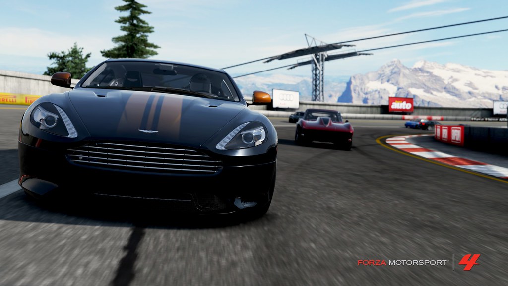
Fallen: the homespace is dreadful for pictures, when you look at that picture you can see the car looks more like a toy. Nice attempt though, with that angle, maybe a bit more zoom but I don't think it'll work. Nr 2 is taken from too close, you can see the barrel deformation is persistent again. 3: good idea, could use a more dramatic angle, with more focus on the Aston's front grille. Lower the camera, a bit further, and zoom a little. Add some speed and aperture until you get the action you want. Add a little exposure so you can see the details in the front bumpers. 4th picture has a nice idea again, I'd try to get the sign completely visible. You definitely have good ideas for original pictures, you'll learn to consider the details along the way, keep it up!
NJP: First picture is a great one, best of the batch. Nice panning, angle, composition. Shame about the vignette (as in your other pictures), it is too much to look good. Look very closely to those corners: you can see it starts with a darker edge, then goes less dark towards the corner. That darker edge makes it look very unreal. The first pictures wouldn't need any vignette at all, really (or just a little, I tend to do vignette 15 to just soften the corners a tiny bit). Pictures that can benefit from vignetting are those close up drift pictures, the amount applied with the Skyline is very good. The tunnel picture is a good idea, but you can also see the photo is too dark. Not an easy subject, I give you that. Second picture would be better if the car was completely on it. As said, best photo is the first, the Skyline close up is a very good second.
NJP: First picture is a great one, best of the batch. Nice panning, angle, composition. Shame about the vignette (as in your other pictures), it is too much to look good. Look very closely to those corners: you can see it starts with a darker edge, then goes less dark towards the corner. That darker edge makes it look very unreal. The first pictures wouldn't need any vignette at all, really (or just a little, I tend to do vignette 15 to just soften the corners a tiny bit). Pictures that can benefit from vignetting are those close up drift pictures, the amount applied with the Skyline is very good. The tunnel picture is a good idea, but you can also see the photo is too dark. Not an easy subject, I give you that. Second picture would be better if the car was completely on it. As said, best photo is the first, the Skyline close up is a very good second.

Othelion- Race Number : 23
Page 1 of 2 • 1, 2 
:: The Paddock :: Forza Discussion
Page 1 of 2
Permissions in this forum:
You cannot reply to topics in this forum
 Home
Home TORA
TORA TURN
TURN